Style Guide
This page collects our general styles and guidelines for content on the new Purchase College website.
To start: intro sentences on the site (like this one) should be short and friendly! They can include links and additional styling.
Most of our web styles and colors come from the color and style guide (PDF), which helps align the new site with other communication efforts across campus.
Fonts
We’re using the Balance font throughout the website, at various weights and sizes. In situations where Balance may be unavailable—for example, in apps or vendor sites—a modern humanist sans-serif such as FF Meta or Helvetica Neue may be substituted.
Typography
Page creators should use the headers and styles available to them in the editor toolbar, and please avoid implementing new fonts using any inline HTML styles. If you have a need for a very specific style, please let us know and we will try to accommodate your request!
Section Headers
Section headers (h2-h6) are available to you via the pulldown editor toolbar. Using these every 100 to 200 words will help break up the text on your page, making it more easily scanned by your readers. Best practices suggest that you use the headers in descending order as you move your readers down the page.
Please use “Title Case” for these headers—meaning capitalize most words, except for certain small words, such as articles and short prepositions.
Colors
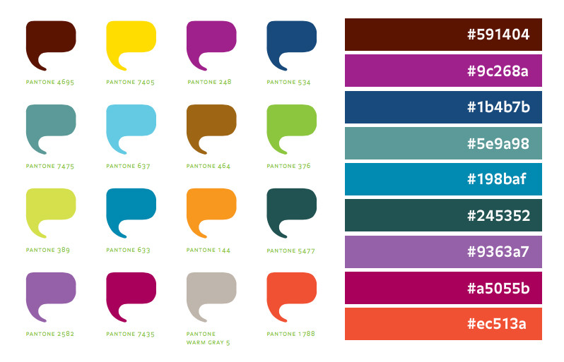
Purchase College has always been a colorful place. Unlike many schools that are decorated solely in the colors of their athletic teams, the Purchase brand guidelines provide a vibrant palette that hints at the diversity of our students and academic offerings.
The darkest of these colors have been approved as “web safe” and are available as accent colors for academic programs— these colors are shown on the right, below.
In addition to the vibrant options above, we’re pulling our core site colors live from our homepage photos—which means that the homepage and site navigation can use different colors from moment to moment, or user to user. For that reason, avoid using color in any descriptive how-tos; for example, always say “Click the Admissions tab” instead of “Click the red tab.”
Editable Areas
Your available web templates will contain areas of the page that are “editable”—where you can add text, images, videos, and more. You never have to use all of your editable areas, and you might find that starting simply works for you. You can always experiment and then undo your changes!
Columns and Layout
These two columns are a great example of using your editable areas to create a page layout. If you leave these columns empty, they’ll disappear—but they make a great visual structure to guide your readers through various types of content. On mobile devices, these columns stack on top of each other for easy scrolling.
Additional Elements
There are other text formatting options available to you in the toolbar, many of which you’ll recognize from Microsoft Word—including bulleted lists, left and right alignment, indents, bold, and italics.
For more information about the editor toolbar, see this page about Editing Pages in LiveWhale.