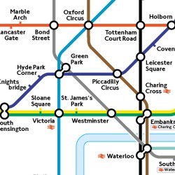
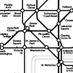
Contrast
Colorblindness and Contrast


There are three main kinds of color blindness, based on defects in the three different kinds of cones that respond to blue, green, and red light.
Red-green color blindness is the most common, followed by blue-yellow color blindness. A complete absence of color vision —total color blindness – is rare.
When designing web content for people who are color-blind you do NOT have to convert all of your images to black and white or get rid of your images entirely. In fact, you may not have to change any of your images at all. The key is to make sure that colors are not your only method of conveying important information. Excerpted from http://webaim.org/
Examples
-
(Bad): A link that only uses color to identify that it is a link.
This link would look like the rest of the text in the sentence to someone who cannot see the color green. This may prevent colorblind users from easily identifying links on the page. -
(Good): A link that uses color plus bold, italic, and underline to identify that it is a link.
Although someone who is color blind may not be able to see that the link is green, they would still be able to identify that it is not the same as the rest of the text in the sentence because it is bold and/or underlined.
Color Contrast Requirements
WCAG 2.0 level AA requires a contrast ratio of 4.5:1 for normal text and 3:1 for large text.
Resources for testing
- The Web Aim Contrast Checker - Enter a foreground and background color, the checker will tell you if this combination passes or fails it’s test.
- Colorzilla - is an excellent tool for extracting the color value from any page element.
- WAVE can analyze contrast ratios for all page elements at once.